 nicht angemeldet


Hallo!
ich habe jetzt folgendes realisiert.
CSS
.gallery  {
    display: grid;
		gap: 0.5em;
}

@media (min-width: 45em) {
	.gallery {
    grid-template-columns: 1fr 2fr 1fr;
	}
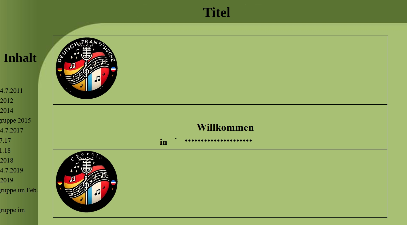
html
<div class="gallery"  style="margin-top:2em;">
  <div>
    <img src="/bilder/bild1.webp" style="max-width:150px; width:100%; height:auto;">
  </div>
  <div>
    <center style="margin-top:2em;">
	<h2>Willkommen</h2>
	<h3>in ............</h3>
	</center>
  </div>
  <div>
  <img src="/bilder/bild2.webp" style="max-width:150px;  width:100%; height:auto;">
  </div>
 </div>
Ergebnis Bilder und Text liegen untereinander statt nebeneinander.
 Matthias Scharwies
 Gunnar Bittersmann
 Rolf B