 nicht angemeldet


 Gunnar Bittersmann
@@Rolf B
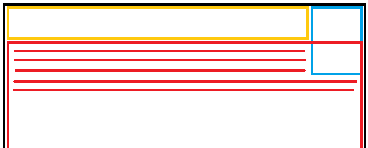
- Sei X = Darstellungsbreite (
min(100vw - Margins, 60em)).- Die Größe der blauen Box ergibt sich aus ihrem Inhalt (width:fit-content).
- Die Breite der gelben Box soll (X - Breite(blau) - Gap) sein. Und zwar responsiv, ohne magic number für Breite(blau).
- Die Breite der roten Box soll grundsätzlich X sein, im Überlappungsbereich soll ihr Inhalt aber der blauen Box Platz machen, die blaue Box soll sich dort also wie ein Float verhalten.
Frage ist: Geht das mit CSS
Geht. display: flow-root FTW. ☞ Codepen
oder ist das außerhalb der Möglichkeiten?
Außerhalb wessen Möglichkeiten? 😏
🖖 Live long and prosper
--
“In my home, the America I love, the America I've written about, that has been a beacon of hope and liberty for 250 years, is currently in the hands of a corrupt, incompetent and treasonous administration. Tonight, we ask all who believe in democracy and the best of our American spirit, to rise with us, raise your voices against authoritarianism, and let freedom reign.”
— Bruce Springsteen, Manchester 2025-05-14