


Div automatisch verlängern aber immer am Boden kleben
Slice
- html
0  Gernot Back
0 Steel0 Gunther
 nicht angemeldet Gernot Back
Hallo,
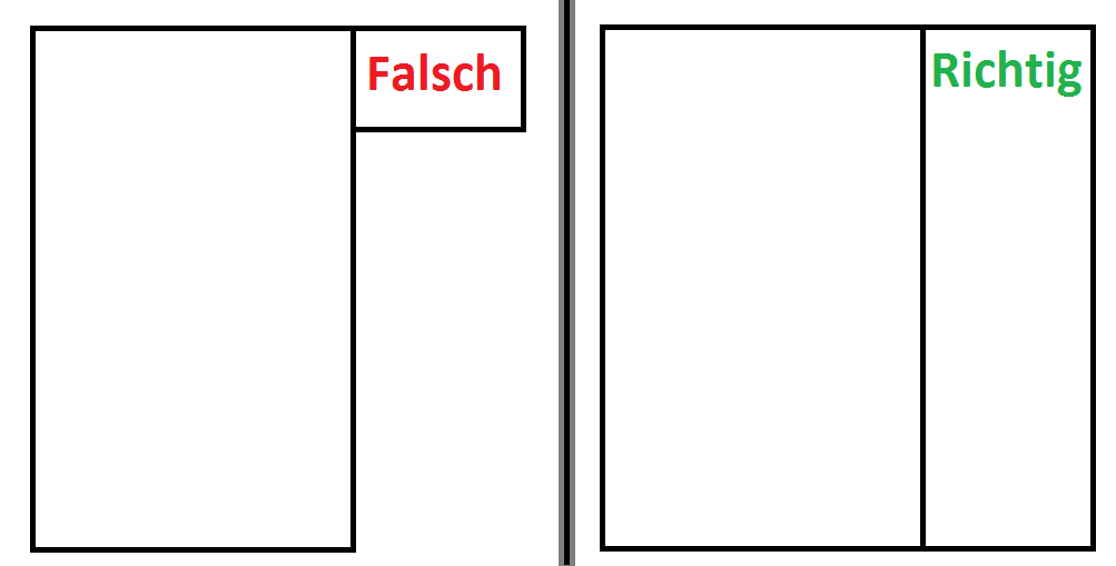
ich habe bin gerade dabei eine Seite zu machen aber ich bekomme es nicht hin das die seit Box sich automatisch verlängert (ohne inhalt), sodas sie immer solang ist als der content.
hier ein Beispiel:
hier meine index.html & stylesheet.css:
<!DOCTYPE html PUBLIC "-//W3C//DTD XHTML 1.0 Transitional//EN" "http://www.w3.org/TR/xhtml1/DTD/xhtml1-transitional.dtd">
<html xmlns="http://www.w3.org/1999/xhtml">
<head>
<meta http-equiv="Content-Type" content="text/html; charset=utf-8" />
<link href="style.css" rel="stylesheet" type="text/css" />
</head>

<body>

<div id="wrapper" align="center">
    	<div id="wrapper2">
        	<div id="s1">
            	<div id="s1-1"></div>
                <div id="s1-2"></div>
            </div><!--s1 end-->
            <div id="s2">
            	<div id="s2-1"></div>
                <div id="s2-2"><!--navi--></div>
                <div id="s2-3"></div>
                <div id="s2-4"><!--contant include-->inhalt</div>
            </div><!--s2 end-->
            <div id="s3">
				<div id="s3-1"></div>
                <div id="s3-2"><!--box include-->box</div>
                <div id="s3-3"></div>


            </div><!--s3 end-->
            <div id="s4">
            	<div id="s4-1"></div>
            	<div id="s4-2"></div>
                <div id="s4-3"></div>
            </div><!--s4 end-->
            <div id="footer">
            	<!--footer inhalt-->
            </div><!-- footer end-->
        </div>
    	<!--wrapper2 end-->
</div><!--wrapper end-->

</body>
</html>
body {
	background-color: #0e0e0e;
	background-image: url(Images/bg.png);
	background-repeat: no-repeat;
	background-position:center;
	margin:auto;
}
#wrapper {
	width:880px;
	margin: auto;
	text-align:center;
}
#wrapper2 {
	width:880px;
	margin-top:0px;
	text-align:center;
}
#s1 {
	width:15px;
	float:left;
}
#s2 {
	width:606px;
	float:left;
}
#s3 {
	width:218px;
	height:auto;
	float:left;
}
#s4 {
	width:41px;
	float:right;
}
#s1-1 {
	height:43px;
	width:15px;
	margin-top:217px;
	background-image:url(Images/img05.png);
}
#s1-2 {
	width:15px;
	height:auto;
	background-image:url(Images/img08.png);
}
#s2-1 {
	width:606px;
	height:217px;
	background-image:url(Images/img01.png);
}
#s2-2 {
	width:606px;
	height:40px;
	background-image:url(Images/img06.png);
}
#s2-3 {
	width:606px;
	height:123px;
	background-image:url(Images/img07.png);
}
#s2-4 {
	width:606px;
	height:auto;
	background-image:url(Images/img11.png);
}
#s3-1 {
	width:218px;
	height:147px;
	background-image:url(Images/img02.png);
}
#s3-2 {
	width:218px;
	height:auto;
	background-image: url(Images/img04.png);
	background-repeat:repeat-y;
	margin-bottom:auto;
}
#s3-3 {
	width:218px;
	background-image: url(Images/img04.png);
	background-repeat:repeat-y;
	bottom:0;
}
#s4-1 {
	height:260px;
	width:41px;
	background-image:url(Images/img03.png);
}
#s4-2 {
	height:120px;
	width:41px;
	background-image: url(Images/www01.png);
}
#s4-3 {
	height:auto;
	width:41px;
	background-image: url(Images/www02.png);
}
#footer {
	height:62px;
	background-image:url(Images/img13.png);
	background-repeat:no-repeat;
	background-position:center;
	height:880px;
	margin-top:0px;
}
Ich hoffe ihr könnt mir helfen.
MFG Slice
Hi!
Schonmal dran gedacht die linke Box in die rechte zu stecken und diese dadurch aufzuspannen? Dann ist natuerlich, die linke evtl. mal kuerzer als die rechte.
Ansonsten halt ichs mit senor Back: faux columns.
Hallo,
neben der bereits vorgeschlagenen Faux Column Technik ist eine der einfachsten Varianten 'display: table-cell;' für die beiden Spaltencontainer.
Es braucht dafür dann noch nicht einmal irgendwelche Wrapper-Elemente mit 'display: table;" und/ oder 'display: table-row', da diese vom Browser als sog. anonymous Elemente selbst erzeugt werden.
Siehe: http://de.selfhtml.org/css/eigenschaften/positionierung.htm#display@title=display
Ein Manko dieser Variante ist, dass sie im IE erst ab Version 8 funktioniert.
BTW: Dein Quellcode ist ein typischer Fall von "Divitis" ... ;-)
Gruß Gunther